The best lawn care website examples in this article are:
Dunner’s Lawn Service
GrassPerson
High Tech Landscapes
Lawns and Palms
Clean Earth Lawn Care
TruGreen
Landscape Services Inc. (LSI)
Greenbeard Lawn Care
Salisbury Landscaping
For each website, we discuss what qualities make it a great example and any aspects we recommend leaving behind.
1. Dunner’s Lawn Service
Dunner’s Lawn Service features large scrolling images showcasing their work on the homepage. In this section of the website, they also display their service guarantee.
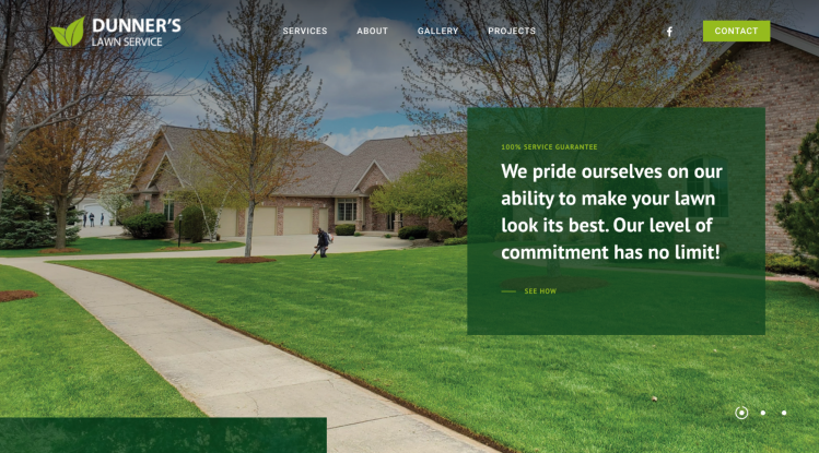
The menu uses a simplistic style, with a Contact button to the right.
The About Us page explains that the business is family-owned, using it as a differentiating factor: “Many of our competitors focus on generating higher revenue, resulting in unnecessary applications and lower levels of customer service. For this reason, Dunner’s Lawn Service offers a customer-friendly experience, which provides results far exceeding expectations.”
A Projects page showcases Dunner’s work, with short descriptions of the project and lots of photos.
The Contact Us page not only includes a lead form but also has the company’s phone number and email address listed if the potential customer wants to contact them directly. A Pay Now button on this page links to their Paypal and allows customers to make payments.
What to apply to your website:
Dunner’s does a great job differentiating themselves from other lawn care service providers in the market. Find your differentiator and promote it.
Including a projects page like Dunner’s did helps to build credibility.
Utilize a clean and simplistic design.
What to leave behind:
The gallery page is a bit cumbersome, with multiple images but no context. We recommend breaking it out by service type or including project stories.
Nesting the Pay Now button on the Contact Us page isn’t intuitive. We recommend including a payment option right on the homepage or making it an option within the website menu.
2. GrassPerson
GrassPerson uses a large, attention-grabbing image with a request for a free quote above the fold on the front page. Upon scrolling down, users see their services offered, testimonials, and a map of loyal customers in their area.
They also list their associations near the bottom of the homepage, which include the National Association of Landscape Professionals and the Texas Nursery & Landscape Association. This helps build credibility. License numbers are prominently displayed in the website footer.
The About page includes a history timeline of the company in addition to a quick stats section, stating:
2,000+ satisfied customers
58 dedicated employees
20 years in business
25 fleets in circulation
And more!
These stats help paint a picture of a trustworthy company that will be around for a long time.
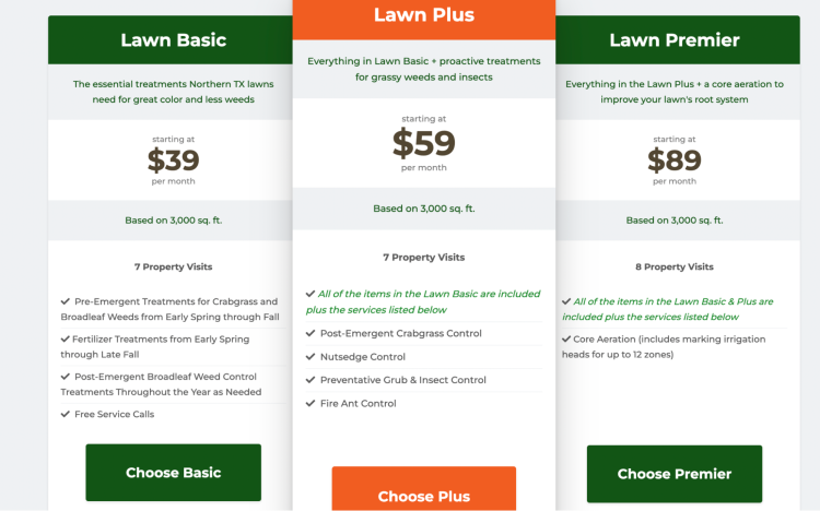
Probably the most effective is their pricing page. Consumers feel more confident contacting a service professional who offers transparent pricing.
What to apply to your website:
Consider adding a Pay Bill button to the homepage, like GrassPerson did.
Incorporate testimonials and a map of customers to build social proof.
Include pricing on your website.
What to leave behind:
The Get a Free Quote button takes potential customers to another page where they must select service type before being forwarded to another webpage. Requesting a quote should be quick and frictionless.
While the map of customers served is a compelling visual, it would be nice to zoom in and accurately see the neighborhoods.
3. High Tech Landscapes
High Tech Landscapes uses video on their desktop homepage, and a static photo on mobile. Both versions provide a compelling aesthetic and a good user experience. Users can view the landscaping company’s commercial and residential services as they scroll down. Further down are testimonials, licenses and awards, and blog articles.
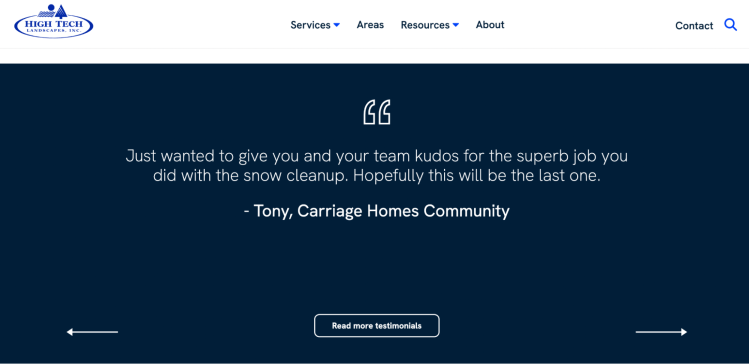
The navigation is simple and includes a Contact button at the top of the page. Under Resources, there’s a landscaping blog comprised of monthly blog posts.
Each service page includes a link with photos of their work. However, the gallery that opens doesn’t allow a way to scroll through the photos. Also, photo titles show, and many aren’t optimized and display titles such as “Image2450_edit_small.”
What to apply to your website:
Capture leads by inviting website visitors to join your newsletter list. High Tech Landscapes does this after showcasing blogs so users know what content they’ll receive.
Showcase license and award information to build trust and credibility.
Prominently feature testimonials to build social proof.
What to leave behind:
Under Services, High Tech Landscapes lists IPHCS, but doesn’t include what the acronym stands for. Nested under that section are services consumers would find relevant, including insect control, plant health care, and turf care. Be sure not to use any industry lingo that consumers may not understand.
Be sure to compress and rename images before uploading them to your website.
4. Lawns & Palms
Lawns & Palms makes requesting an estimate super simple directly from their homepage. Next to the lead form, you see they’ve been in business since 2005, which helps build trust. They also include a pet-friendly badge, which is a good business differentiator.
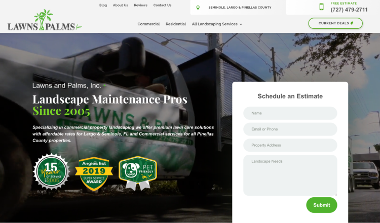
The About Us page displays a video with five reasons to hire Lawns & Palms. A Reviews page includes several testimonials, and the company also shares a combined rating across review sites in the website's footer.
The menu includes breakout pages for commercial and residential services and individual service pages like tree trimming, irrigation, and lawn care.
The Deals page on the website is compelling, but all three deals appear to be expired. In addition, the website could use project stories and photos.
What to apply to your website:
Incorporate a lead form as one of the first things prospective clients see on your homepage.
Communicate differentiators, like being a pet-friendly business or using eco-friendly methods.
Use videos to keep attention on your website and provide information in an easily digestible format.
What to leave behind:
One of three badges on the front page is a Super Service Award from 2019. There’s no need to display awards over a few years old, as it leaves people wondering why you haven’t earned them since then.
The About Us page could use some personalization, including information about the history of the company and the employees.
5. Clean Earth Lawn Care
Clean Earth Lawn Care uses a simplistic green design scheme, which complements their company mission of delivering outstanding lawns while reducing environmental impact. Right off the bat, eco-conscious customers know this company cares about their footprint and provides an all-electric alternative.
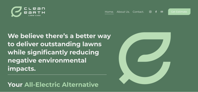
They also include a Get Estimate button directing a simple lead form.
On the About Us page, the owner shares his personal story about why he started the company and a photo of his family.
Wondering why you’d want to hire this company? They also include statistics on their About Us page, such as “gas-powered lawn mowers produce 11 times as much emission as a new car.”
What to apply to your website:
Highlight your differentiating value propositions, like Clean Earth’s commitment to eco-friendly lawn care services.
Personalize your About Us page so potential clients feel comfortable contacting your company.
Include links to your social media pages in a prominent position on your website. Clean Earth Lawn Care has them next to the menu in the header.
What to leave behind:
The services offered are listed if you scroll down on the main page, but the description is minimal. It would benefit the company to make Services its own page, accessible from the menu.
Use a design aesthetic that matches the ethos of your company.
6. TruGreen
TruGreen provides an excellent example of a franchise website. Right at the top of the page, it says “Find a branch.” After you click, you can enter your zip code to find a TruGreen near you.
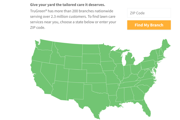
A banner across the homepage with a 50% off offer directs you to their quote builder. The custom quote builder is linked and embedded multiple times throughout the website.
Testimonials are featured prominently on the homepage. There’s an FAQ page broken out into sections like “Before my service,” “After my service,” and “Billing.” The page also features a video outlining what to expect as a TruGreen customer.
TruGreen also includes a login portal for existing customers and links to download its mobile app.
What to apply to your website:
TruGreen provides a custom quote builder that considers lawn issues, size, and property details. This gives customers confidence to book services, knowing how much they’ll pay.
Gain inspiration from TruGreen’s FAQs, which comprehensively answer customers' questions before or after their service.
Use consistent branding across your website.
What to leave behind:
The website includes eight disclaimer footnotes in the footer. Avoid making numerous claims you need to footnote.
The plans and services drop-down menu includes 15 items, which is overwhelming. Instead, they could have a Plans page outlining all the plans and a Services page visually showcasing all of their services.
7. Landscape Services Inc. (LSI)
Landscape Services Inc.’s website opens up to large scrolling images and a clean menu. As you scroll down, they display their core values and guarantee.

LSI includes testimonials on their homepage and links to their social media profiles. The Contact button in the upper right redirects you to a straightforward lead form.
The About Us section has team bios, company mission statement, green initiatives, news, awards, affiliations, community stewardship, and locations. On the Community Stewardship page, LSI lists several organizations their company supports.
The navigation includes services and industries, and you can click on each for more detailed information. They also include a portfolio with photos of their work.
What to apply to your website:
The use of core values on the LSI website is a very honest way to build trust with potential customers.
Make sure your external links (like social media pages) open in a new tab so you keep users on your website.
Include bios of your team members on your About Us page to offer new leads a personal experience.
What to leave behind:
Instead of including a contact button that takes users to another page, embed your lead form on the homepage.
The portfolio section includes a few images per service type but doesn’t include any project details or narrative, making it largely ineffective.
8. Greenbeard Lawn Care
Greenbeard Lawn Care’s website isn’t the most sophisticated in design, but the family-owned business makes up for it in the nods to their brand.
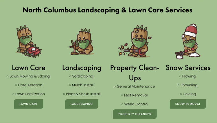
They mention they’re a family-owned business and show a picture of a baby in a company onesie on the homepage. This endears potential customers and makes them a little more forgiving about the design shortcomings.
Greenbeard includes a lead form on their homepage, which is best practice. Website navigation includes About Us, Services, Our Pricing, Contact Us, Blog, and FAQ. Each service page provides comprehensive detail on their methods. The Pricing page is also comprehensive, listing prices for various services like lawn mowing, aeration, and mulching.
Greenbeard provides more value to website visitors through the Blog and FAQ pages. Overall, the website is very informative and easy to navigate.
What to apply to your website:
The cartoons with the green beard are great branding and could be carried through to several marketing pieces.
A lead form is front and center on Greenbeard’s website, which we recommend.
The About page lists many differentiators, including family-owned, sustainable practices, and personalized services.
What to leave behind:
This website could use the assistance of a professional web designer to clean up and modernize it.
Greenbeard lists their phone number and email address on their website but didn’t make them clickable links to call and email.
9. Salisbury Landscaping
Salisbury Landscaping’s website showcases their expertise in creating stunning outdoor spaces through large scrolling images on the homepage. The layout immediately captures visitors' attention and showcases their impressive work with high-quality images.
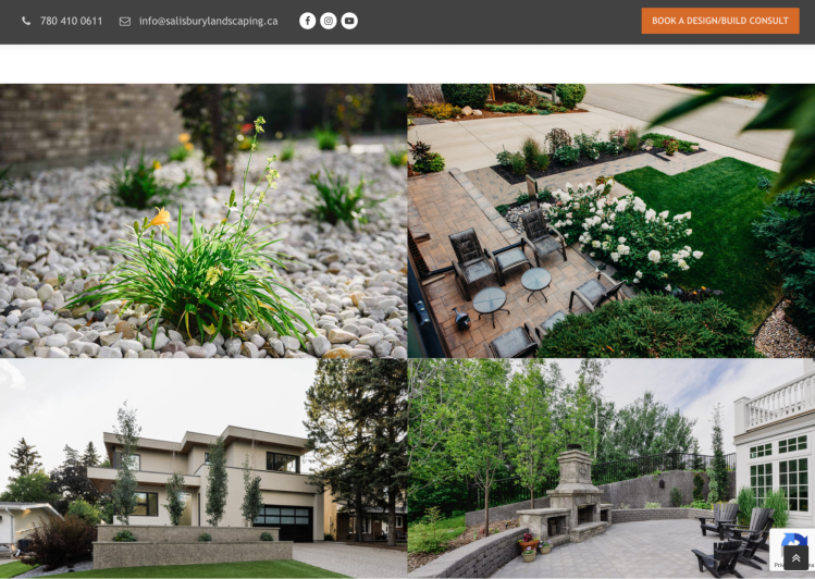
The landscaping website's design follows a clean and simplistic style, creating an inviting and user-friendly experience for visitors. The menu is streamlined, making navigation effortless, and a contact button is conveniently placed for easy access.
Salisbury Landscaping further enhances their credibility with a projects page that showcases their completed works. Brief descriptions and a collection of captivating photos accompany each project.
What to apply to your website:
Hire a professional photographer to take images of your work for your website. The landscape design imagery on Salisbury Landscaping’s website is very captivating.
Highlight your differentiators. Salisbury Landscaping has a “What makes us unique?” header right on their homepage.
Within the photo gallery, you can click on each image for project details, which include which team member worked on the project.
What to leave behind:
The lead form asks for quite a bit of detail. Simplify it to capture more leads, then request more information once you reach out.
The “Check out our greenhouse” link doesn’t open in a new tab, causing users to leave the website.
Lawn Care Website Best Practices
Many examples above made our list because they include website best practices, from the technical backend (SEO) to the design, which maximizes user experience.
Structure a clear and intuitive navigation: Structure your company’s services and website pages logically. User-friendly navigation elements include simple menu labels, a dropdown menu, and a sticky menu, which is the fixed navigation menu at the top of your website.
Optimize for mobile devices: Develop a responsive design to ensure seamless viewing across different screen sizes. Prioritize mobile-friendly design to enhance functionality and user experience, and improve SEO rankings.
Focus on design and branding: Design your website with a clean and visually appealing layout. Maintain consistent color schemes and typography.
Showcase customer testimonials and reviews: Highlight positive customer reviews and testimonials to build credibility. Consider using customer photos or videos to add a personal touch.
Present services and transparent pricing information: Organize a comprehensive menu showcasing different lawn care services. Offer transparent pricing information or provide online estimation tools. Regularly update your services and prices to stay current and relevant.
Simplify contact forms: Create responsive and user-friendly contact forms for accessible communication. Place contact forms strategically across various website pages. Keep forms concise and relevant to the content on each page. Make sure the call-to-action (CTA) is direct, like “book now” or “request a quote.”
Introduce your team: Develop a captivating About Us page that establishes your company's credibility. Include professional team photos and individual bios for a personal touch. Highlight your company's background, experience, mission, and values. Showcase certifications, awards, associations, and customer reviews to build trust.
Ready To Level Up Your Lawn Care Website?
From your company website and ad landing pages to social media and more, an online presence proves crucial in the competitive lawn care industry. Now that you know what works and doesn’t work on a website, take action to revamp or build your own. Choose what inspires you from the best landscaping website examples outlined to create a great website that optimizes conversions.
Need help? ServiceTitan Marketing Pro fully integrates with FieldRoutes to give your business the power to boost revenue with existing customers. Book a free demo today.

